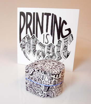
For my Merging Media class, we had to come up with a feature and a pavilion for a public park in Atlanta. I chose Tanyard Creek Park, which is fairly small, but since it's right along a creek, it is quite lovely. It also has a large open field, which I thought would be great for a pavilion.
Below you'll find my pavilion rendering, which includes a large dog-like structure with two smaller dogs that serve as a pool and a bench.
My park feature is singing birds. I made a short animation that shows what they do.
For Experiential Design, we had to create a pop-up experience for some technology product of our choice. I went with Zuta Pocket Printer, which should come out shortly.
For this class I ended up doodling a bunch!
Here's my book cover, featuring the event logo and the model I made for a "pager" (similar to restaurant pager you get when you have to wait for your table):
Below is a gif logo animation:
via GIPHY
Here are some of the illustrations I made for the inside of the book:
 |
| The event tent at Oglethorpe University during Orientation Week |
 | |||
| Inside the tent, you can find Zutar, the fortune-teller printer. You just place the printer on a sheet of paper, ask Zutar a question, and the answer would be printed out for you. |
 |
| You can also relax in the lounge area and enjoy a toast with no-paper jam, because there's no paper jams with Zuta |
 |
| You can print your name on a free magical notebook! |
For Information Design and Data Visualization, we had to design a currency system:
This system honors the working class and heroes, to remind everyone on whom our economy is based.
We also had to design a manifesto poster that can be grounded by making a connection to an actual organization that work toward the same purpose.
My manifesto is to use my generalist propensities to make people see that there's enough in this world to go around if we don't hoard it all to ourselves. Basically, to show that the people on the top should not take more than they need, cause that hurts everybody, which is exactly what the organization United for a Fair Economy does.
Instead of a poster, I made an animation (special thank you to all the people who gave me a hand):


3 comments:
So many awesome things! :) I like this large dog-like structure in pavilion. It's quite weird, but in a good way. And am I right, is this smaller dog in the pool taking a piss? :D :D It could be great fountain then! ;)
And I love how detailed and refined are the illustrations for the book and the magical notebook really is magical.
Such a great job, Dorit! :)
I forgot to mention that logo animation is also excellent!!
Thank you, Hanna! Yes, the little dog in the pool is taking a piss! :)
Post a Comment