I've been going to live drawing sessions at school, where there's a group of artists gathering around a model. The model stays in one pose for a particular length of time, starting with a few 2 minutes sessions for gesture drawings, then 5 and 10 minute sessions, and finally 3 20-minute sessions. It's wonderful to see how the artists in the group work. They each have their style and what they like to focus on, which can change from session to session depending on the model and how she or he poses.
The models do their best to stay in one position for the time period, and it isn't easy. This cannot be said of zoo animals. They would pose sometimes, but only for a brief second. You'd start drawing them in profile, and before you're done with the first line, you see them completely facing you. Or showing off their butts.
Which is what happened with this elephant at Zoo Atlanta.
And the rhino.
The Laughing Kookabara was pretty good.
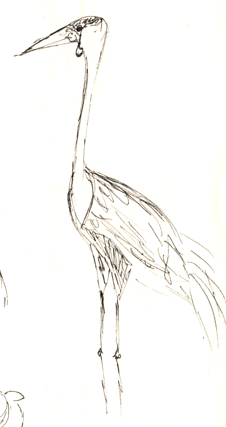
The Wattled Crane constantly dug in the ground.
This Wreathed Hornbill is my favorite, even though he wasn't standing still either, and kept hiding behind a post.
Boy, what a whirlwind this quarter has been! I felt like I was back in first quarter with the amount of work to be done. Or maybe it only felt like that because this time I tried to maintain some residue of normal life, such as eating, sleeping, and going to the gym. Also, there was the 48-Hour Repack, an event organized by AIGA where teams in different schools compete on repackaging one of a few designated items during a single weekend. No wonder this quarter was exhausting!
This quarter the most demanding courses were Packaging 1 and Publications & Editorial Design. For Packaging, we had to repackage 3 sets of products: a trio, a duo, and a single. Each one had to feature a certain design language, which we could assign as we chose: graphic, color, and type.
For all of my packaging sets I wanted to go with sustainability, so they're all about reducing impact on the environment.
For my trio, I used graphic design language for repacking individual Clif Bars, where the wraps can turn into a postcard that you might send to your friends, to tell them about your adventures:
The artboard shows how the wrap can turn into a postcard, and the inner wrap (to protect the postcard) can be easily dissolved in water.
The wraps represent activities associated with certain parks: rock-climbing in Joshua Tree NP, canoeing in the Grand Canyon, and hiking the Appalachian Trail.
For my duo, I used color design language to design new bottles for Nature's Gate body lotions that you can re-fill by buying refill packs:
For my labels, I used a technique I learned from Hannah Guthrie, where you photograph flowers and food die that swirl in water-filled bathtub. Theo helped with painting Kambucha bottles and making their caps smooth and integrated with pumps.
For my single, the remaining design language was type, and I decided that King Arthur Flour want to reveal a secret that would convince their customers that they do not need to buy more self-rising flour:
For Publications & Editorial Design we had to design a magazine and book covers for a trilogy. My chosen trilogy was Ferrol Sams'. I absolutely adore these books! I am still enjoying them, as they are 1500 pages long all together, and I didn't really have much time to dedicate to reading. They are written so well, and are entertaining as they are enlightening. The books follow the life of Porter Osborne, Jr. from childhood in a Georgia farm during the Great Depression through his college years in Macon, GA, and into his days in med school and as a medical corps serviceman in World War II.
For our book cover designs we had to use Swiss (or International) design, which means lots of grids and geometric shapes, and a very clean and simple typeface.
For my magazine, I decided to feature a dream of mine: making Sandy Springs, GA, where I live, into a pedestrian-friendly town. The city decides (in my dreams) to turn strip-mall parking lots into parks.
The masthead
Here I pretend the contributors are the people in the picture, and you can identify them by what they're wearing, which is mentioned in parentheses in their short bios
Besides these very demanding classes, we also had Logos, Metaphors & Symbols. Here are the 8 logos I designed:
For Running of the Bulls
Bauhaus Toys
Love Symbol
RoostersRise Beer
Cattle Baron's Ball (an American Cancer Society charity event held in Texas)
Thistle Farm (a research farm for genetic engineering in animals)
Hartsfield-Jackson International Airport
Lucullian Ristorante, a slow-food restaurant in Northern Italy
We also had to design a poster based on Marshal McLuhan's book The Medium Is the Massage:
Here I wanted to show the fear previous generations have of and for Millennials and the effect that technology and social media has on them. Basically, it's not all bad, and the fear is actually from the fact that Millennials are more open-minded and liberal. This scares the sh*t out of people who equate success with fancy houses and expensive cars.
Well, now I am on a two-week break, and I am so ready to relax. But before I go, I must share this video I helped make as part of our 48-Hour Repack team, headed by Caroline Skarupa, with 3 additional students: